|
[The central metaphor of From The Wilderness is the "map." Standing outside the media metropolis of buzzwords and microanalysis, this journal attempts to survey the landscape of our global predicament from a vantage point high enough to take in the giant trends and the myriad lines of force. A map-reader's motivation is two-fold: if anything can help a person to navigate a burning world, a map is surely paramount. But the other motivation is the map's intrinsic interest. Inside a continuous haze of hypnotic advertising, corporate propaganda, and government indoctrination, one can only see a few pixels into the near distance, and one yearns for a synoptic grasp of the larger picture. We at FTW try our best to develop such a picture.
"Footprints," our new story from Science Editor Dale Allen Pfeiffer, uses a remarkable set of maps from National Geographic to present an arresting account of mankind's current ecological impact, especially regarding energy use. Dale wishes to thank National Geographic, Dr. Bill Rees, who originated the "ecological footprint" concept, and a dear friend, Pamela Goins, for first planting the seeds for this article by laying out the map of our global footprint on her kitchen table. -JAH]
Footprints
National Geographic Satellite Images Reveal A Deeper Truth About the Industrialized and Mankind
by
Dale Allen Pfeiffer
© Copyright 2005, From The Wilderness Publications, www.fromthewilderness.com. All Rights Reserved. This story may NOT be posted on any Internet web site without express written permission. Contact admin@copvcia.com. May be circulated, distributed or transmitted for non-profit purposes only.
Introduction
Everything that moves on the surface of the Earth leaves a track, a record of its passage. An expert tracker, such as Tom Brown Jr. (www.trackerschool.com) can read these tracks so well that they become a record of the animal's life, a sort of a biography through which a very intimate knowledge of the animal can be achieved. Among the easiest animals to track are human beings, because they leave an easily readable path. According to American Indian scouts, the goal is to leave the smallest footprints possible. In doing this, you honor the Earth by leaving it as unaltered as possible, and you render yourself invisible to any who might try tracking you.
In this, as in so much else, the American Indian philosophy is almost diametrically opposed to the European-derived American perspective. In the dominant culture of conspicuous consumption, the size of your footprint is a display of your wealth and power, rather like a peacock spreading its plumage. In American culture, status is achieved by the size of your McMansion, the mileage of your automobile (with Hummers being a pure statement of extravagance), and in the amount of trash you set out at the curb every week. The American indulgence is well symbolized in the folk legend of Paul Bunyan, the giant who could fell whole forests with one swing of his axe, and created the Great Lakes from his footprints.
Yet, for any who still hold the perspective of the ancients, conspicuous consumption is a gross display of ignorance and foolishness. That enormous footprint displays nothing so clearly as our Achilles Heel. Namely, that we are an easy target for environmental overshoot, and our own over-consumption will bring us down in the end. Even the great Paul Bunyan logged himself out of a job in the end, when he had felled all the large forests.
This is why scientists who have studied the closely linked problems of over-consumption, resource depletion, and pollution have reached the consensus that we need to set aside consumer capitalism and instead extol the virtues of sustainability. We need to reduce the size of our footprint before it engulfs the entire planet. A modern adaptation of the Paul Bunyan story has Paul realizing the error of his ways as he looks out upon the last stand of virgin forest. Paul converts to a spokesperson for the environment, planting trees and protecting the forests from harm.
Plotting Your Footprint
Given the number of people on this planet and the all-pervasive nature of the dominant culture, it is very difficult to step aside and reduce your consumption until you are self-sufficient. Sustainability is an elusive goal.
There is an interesting exercise you can undertake online to get an idea of how big your footprint is. You can find this exercise at the Global Footprint Network, http://www.footprintnetwork.org/. This is a nonprofit organization for the advancement of sustainability. At the bottom of their home page, you will find links under the heading, Ecological Footprint. The link you want is called "Your Footprint." This link will take you to a program which will ask you a number of questions about your consumption and waste generation habits. Once you have answered all of these questions, the program will compute your footprint in acres. The results can be very eye opening.
For myself, I computed a total footprint of 12 acres. My wife computed 10 acres. She is a vegetarian, while I slipped off that wagon when my daughter came to live with us. In comparison, the average US citizen has a footprint of 24 acres. While we could pat ourselves on the back for halving our average national footprint, the program still cautions us that if everyone were to live like me, we would need 2.7 planets. If everyone were to live like my wife, we would need 2.2 planets.
We are planning to move someplace where we can lead a more self-sufficient lifestyle. The footprint program informs us that if we were to go totally vegan, grow most of our food, and live in a green-designed residence with energy conservation and efficiency, then we will be able to trim our total footprint down to 5 acres. This lifestyle, we are informed, would be almost sustainable. If everyone lived like this, we would only require 1.2 planets. There are a few other things we could do to bring that number down to 4.5 acres, which is considered to be fully sustainable. We could buy a hybrid car, or do without a private automobile entirely.
There is some disagreement about the accuracy of these numbers. For one thing, this program does not consider work related consumption. As a writer, my written word is printed in newsletters and books. But then, should this printed matter be considered a part of my consumption, or should it be accorded to whoever purchases it? When you start considering questions like this, you are drawn into public consumption patterns in which we all share a part.
Anyway, though there is some dispute about the actual numbers and the methodology, nobody disagrees about the trend. There are only 4.5 biologically productive acres per person on this planet (not considering all of the other inhabitants of the biota). Yet the figures are plain; as illustrated in the following graph, the developed world (where most of the readers of this essay reside) consumes the lion's share of the world's resources, far in excess of sustainability.
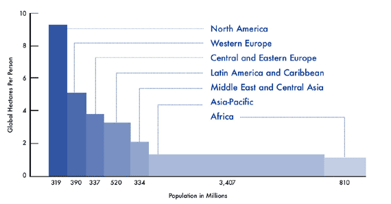
taken from The Global Footprint Network, http://www.footprintnetwork.org/gfn_sub.php?content=national_footprints
The US leads the world in conspicuous consumption (average footprint 24 acres per person). For comparison, Canada has an average footprint of 16 acres, Western Europe averages about 12 acres, Australia averages 19 acres, Israel averages 13 acres, China averages 4 acres, India averages 2 acres, and Afghanistan and Haiti average 1 acre per person. Though China averages only 4 acres per person, India only 2 acres, and Indonesia only 3 acres, they are rendered unsustainable by the sheer number of people, and their footprints per capita are growing. It is interesting that footprint heavyweight U.S. of A. has been pushing around the welterweights: Afghanistan, 1 acre; Iraq, 3 acres; Haiti, 1 acre; Iran, 5 acres; Venezuela, 6 acres.
This is why scientists who have studied sustainability have said that it is only achievable if the developing world limits population and the developed world limits consumption. Yet, so far the US and certain other countries have refused to consider this strategy. The reason given is that a constraint on consumption would hurt the economy. And so it is a choice between whether we will constrain ourselves and throw away the consumer capitalist, throwaway civilization, or whether we will have those constraints forced upon us by resource depletion and pollution.
Personally, I prefer a voluntary withdrawal from this system, a withdrawal to something more self-sufficient and satisfying. But there are many who are still unaware of the choice we face, and there are many who deny the facts of our predicament. These latter adopt a "show me" attitude. And yet the global footprint is not an abstraction; it can be viewed directly, thanks to satellite technology.
Global Footprint, Group Portrait
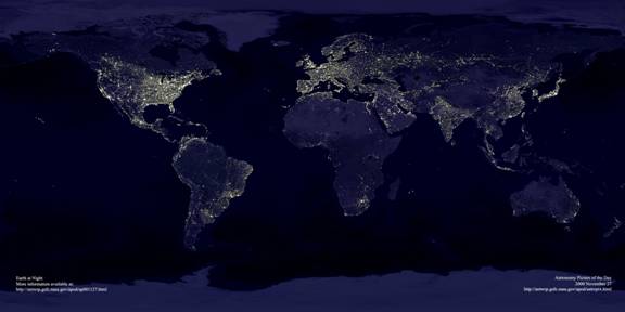
Earth at Night
Astronomy Picture of the Day, NASA, Nov. 27th, 2002.
http://antwrp.gsfc.nasa.gov/apod/ap001127.html
It is in the dark of night that we can best see our footprint on this planet. Here we can see the developed world outlined by electric lights. While it is a spectacular view, it is also a map to the squandering of energy resources. It is astounding how much detail can be seen in this NASA composite satellite photo. This is a map of technological man. The extent of Homo sapiens hydrocarbonus is here clearly delineated. From this overview provided by NASA, we will now switch to more detailed shots taken from a map prepared by the National Geographic Society, titled "Earth at Night." The full map can be ordered from the National Geographic Map Store.
North America
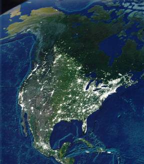
Here we can see the profile of conspicuous consumption, revealing the most gluttonous region on the planet. Note that all of the coasts are outlined in light, and - aside from the far north - the only portions which are not lit up are small patches in the west, Michigan's upper peninsula, and the interior of Maine. The lit up areas represent where energy use is the greatest, which also tends to be where humanity is the most concentrated. These are among the areas which will suffer the most as we make the long and bumpy ride down the slope of energy depletion.
Note the red light in the lower portion of the picture, off the northern coast of the Yucatan Peninsula. This represents natural gas flaring at the Mexican oil platforms in the Gulf of Mexico. Red in these images therefore represents where oil is being extracted. Also note the lack of red lights in the US and Canada. This does not mean that the US and Canada are bereft of hydrocarbon resources. In these countries, there are regulations on the flaring of natural gas. There is also a strong demand for natural gas as a fuel in its own right. Fifty years ago, you would have seen red lights across Texas and elsewhere. And without the latest technology, today you would see red lights pinpointing US platforms in the Gulf of Mexico, and also in Canada and Alaska. Note the splotch of white light on the northern coast of Alaska. This represents the Alaskan oil operations.
South America
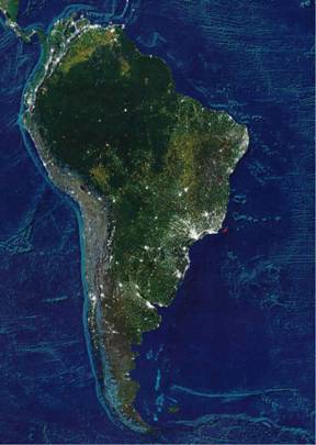
Here we see much less evidence of Homo sapiens hydrocarbonus, mostly confined to the coast. The use of technology falls off drastically toward the interior. Note the oil production off the coast of Brazil, not too far from Rio de Janeiro, and also on Cape Horn, in Argentina. Other notable oil operations can be identified in Ecuador and Colombia. The oil operations in Venezuela stand out very clearly. This is the region from which the US receives a good portion of its oil imports, and this is the main reason why the US is trying to overthrow the government of Presidente Hugo Chavez.
Note the tendrils of light spreading into the interior from Rio de Janeiro, and from Buenos Aires and Montevideo. These represent the roads which are taking civilization to the interior. Look at the interior of the continent, particularly in Brazil, Bolivia, and to the south of Colombia and Venezuela. The yellow lights represent slash and burn agriculture. This is where the Amazon rainforests are burning, clearly distinguishable from the sky at night.
Australia, New Zealand, and Indonesia
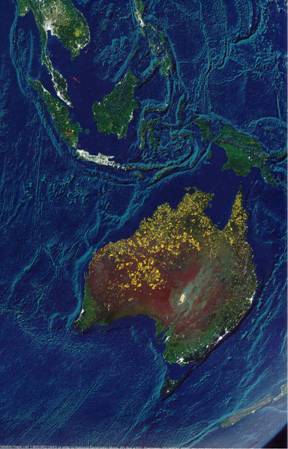
The most notable feature of Australia at night is the wildfires in the outback, some caused by humans, but many the result of lightning storms during the dry Australian summer. New Zealand, in the lower right corner, is almost devoid of lights. This is why some people believe New Zealand is the spot to ride out the end of the oil age.
Now look to Indonesia in the upper portion of the map. Indonesia is the third most populous nation on the planet, with over 228.4 million people. As can be seen on this map, most of those people are concentrated on the island of Java. Indonesia is an OPEC member, though there has been speculation that it may soon lose its membership as its oil production slowly diminishes. The red lights on Sumatra represent the bulk of Indonesia's oil production.
Asia
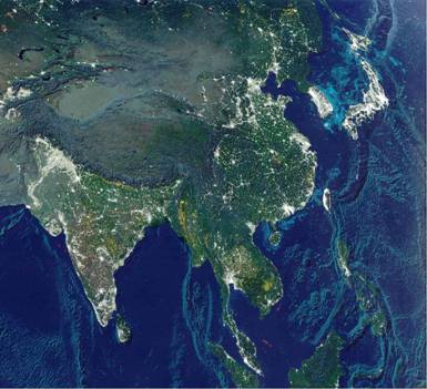
Here we have the most densely populated region of the world; the majority of the human population can be seen in this group portrait. Note the total lack of natural gas flares in India. The population there is almost entirely dependent on imports for their hydrocarbon needs. This does not bode well for the people of the Indian subcontinent, and this is why they have formed a pact with long-time rival, China, for access to oil imports. The lack of gas flares in China, on the other hand, is the result of sophisticated extraction technology. The natural gas is either being reinjected to keep up pressure in the reserves, or it is being utilized to produce energy. Once again, this was not the case just a few decades ago.
Take a look at Japan and South Korea, brightly lit up. Contrast the latter to North Korea, the border between the two being clearly demarked where the light stops at the 38th parallel. Do you see the light blue in the waters surrounding Japan and South Korea? This represents large floodlights employed by the fishing fleet at night, to draw squid and other sea creatures to the surface where they can easily be caught. This is the sign of fisheries on the brink of collapse. Similar lights can be seen off the coast of China and in a few other spots in the other images.
Finally, this image also shows Vietnam's offshore oil operations, off the southeast coast of that country. Malaysia also shows evidence of oil production, both offshore and on the east coast of the Malaysian Peninsula.
Africa
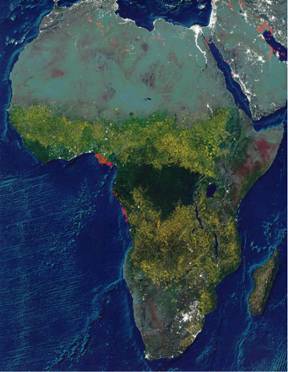
The yellow lights which symbolize slash and burn agriculture can be seen all across Sub-Saharan and Southern Africa. Indeed, much of Africa appears to be ablaze. Homo sapiens hydrocarbonus appears to be largely confined to the fringes of the continent, with the largest concentrations in South Africa, and along the Barbary Coast and the Mediterranean, in the countries of Morocco, Algeria, Libya and Egypt. Note the concentration of population along that cradle of civilization, the Nile.
Oil production is clearly visible, scattered across Algeria and Libya, and to a lesser extent in Egypt and along both shores of the Gulf of Suez. By far the largest reserves of oil are found off the west coast of Africa, from Angola north to the mother lode on and off the coast of Nigeria. It is of prime interest that Africa's oil bearing regions have been areas of conflict and political tension for many years (see FTW's "Beginning of the Oil Endgame"), from the Algerian struggles for liberation from French control, to the US led embargo against Libya as a terrorist nation (and now the increasingly friendly relations and easing of restrictions), to numerous interventions in Angola and Nigeria and neighboring countries. This includes Shell Oil's involvement in the execution of environmental activists in Nigeria and the recent revelation of Halliburton bribing Nigerian officials, and the attempted Equatorial Guinea overthrow plot which snagged Sir Mark Thatcher (son of Former Prime Minister Lady Margaret Thatcher), and likely involved elements of US and British intelligence along with various parties that have a vested interest in the oil business.
We will have a better look at the Middle East in our next image.
Europe, Russia, Central Asia, & the Middle East
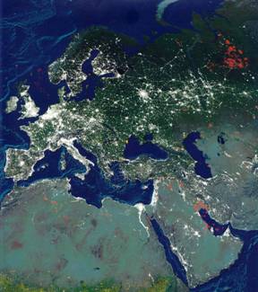
Our final image comprises multiple theatres. And in this one image, we take in the majority of the planet's remaining energy resources.
Let us first look at Europe, with its marked presence of Homo sapiens hydrocarbonus. Note the dense populations, and the lack of observable oil production. The only large oil deposits in this region are denoted by the natural gas flares in the North Sea. Aside from these declining fields, Europe is virtually dependent upon oil imports.
In the upper right section of the image, we see the oil fields of Siberia, which are of so much interest to Europe, China, Japan and the US. South of Russia, we see some oil activity in Georgia, and in the Central Asian countries surrounding the Caspian Sea. This region, which until very recently was where many hopes of future hydrocarbon riches were pinned, obviously boasts only modest hydrocarbon production.
Allowing our gaze to drop below Central Asia, we arrive at the Middle East, where the bulk of the world's hydrocarbon resources are located, and where the entire world has increasingly focused its attention. First let us observe how patchy are the lights of Homo sapiens hydrocarbonus in this region. The population is concentrated in Riyadh (in the middle of Saudi Arabia, around Abu Dhabi and Dubai on the eastern Musandam Peninsula, in Qatar and Bahrain, heavily in Kuwait, and extending from the Red Sea port of Jedda, inland to Mecca and southward. The highest concentration of Homo sapiens hydrocarbonus is to be found in Israel and Lebanon, areas which are virtually bereft of hydrocarbon resources. Also compare the scattered population centers of Iraq (where the US is slowly losing hold in its efforts to occupy that country), with more widely populated Iran (which some in the US are hoping to target next).
Finally, we cannot keep our eyes away from the oil fields. In this image, we can plainly see how most of the oil reserves are concentrated in the Persian Gulf and extending inland along the Tigris and Euphrates River Basin, in Iraq and Iran. The large fields of Saudi Arabia are seen to cover only a small eastern portion of that country, extending slightly inland from the gulf. This is the Arabian Oil Triangle. Outside of this region, there are some smaller deposits in northern Iraq, around Jedda and north of there on the Red Sea, and in the countries of Oman and Yemen, on the southern and western portions of the Arabian Peninsula. But it is in the Arabian Oil Triangle where the majority of the world's remaining hydrocarbon wealth is concentrated, and around which the final days of the Oil Age are destined to be played out.
Conclusion
We have learned how to gage our own personal footprints, and in so doing received some clues as to how we can shrink our footprints and so move toward self-sufficiency and sustainability. And we have seen the footprint of humanity in its entirety written out across the surface of the planet. Certainly, there are many aspects of this footprint which are missing here: air, land & water pollution, the amount of natural habitat fallen and falling to agriculture and other development, the mass extinction currently taking place on this planet, and the depletion of resources-to name a few. But we can see that there are few places remaining on this planet which have been spared from our footprint.
The images of the Earth at night show us how great our reach is. They also show us how overextended we are, and how vulnerable we are to the collapse which inevitably follows upon the overextension of any species beyond the carrying capacity of its environment. The abundance of resource wealth - particularly energy wealth, which the technological revolution of the last two centuries brought into our grasp, has been largely squandered. Our population has climbed exponentially following the curve of energy production. But the subspecies which has evolved over the last couple centuries, Homo sapiens hydrocarbonus, could quite possibly be the most short-lived lifeform on the planet. The world we face will not be able to support Homo sapiens hydrocarbonus for much longer. And we have all but forgotten how to exist without hydrocarbons. It is time for Homo sapiens to evolve a new subspecies, and hopefully this subspecies will be wiser than hydrocarbonus. We must make it our hope and our goal that the next subspecies will be more egalitarian in nature, possessing a better understanding of her place in the scheme of things and born of a vision of sustainability and harmony.

Please Note
This function has been disabled.
|
|
|
|


